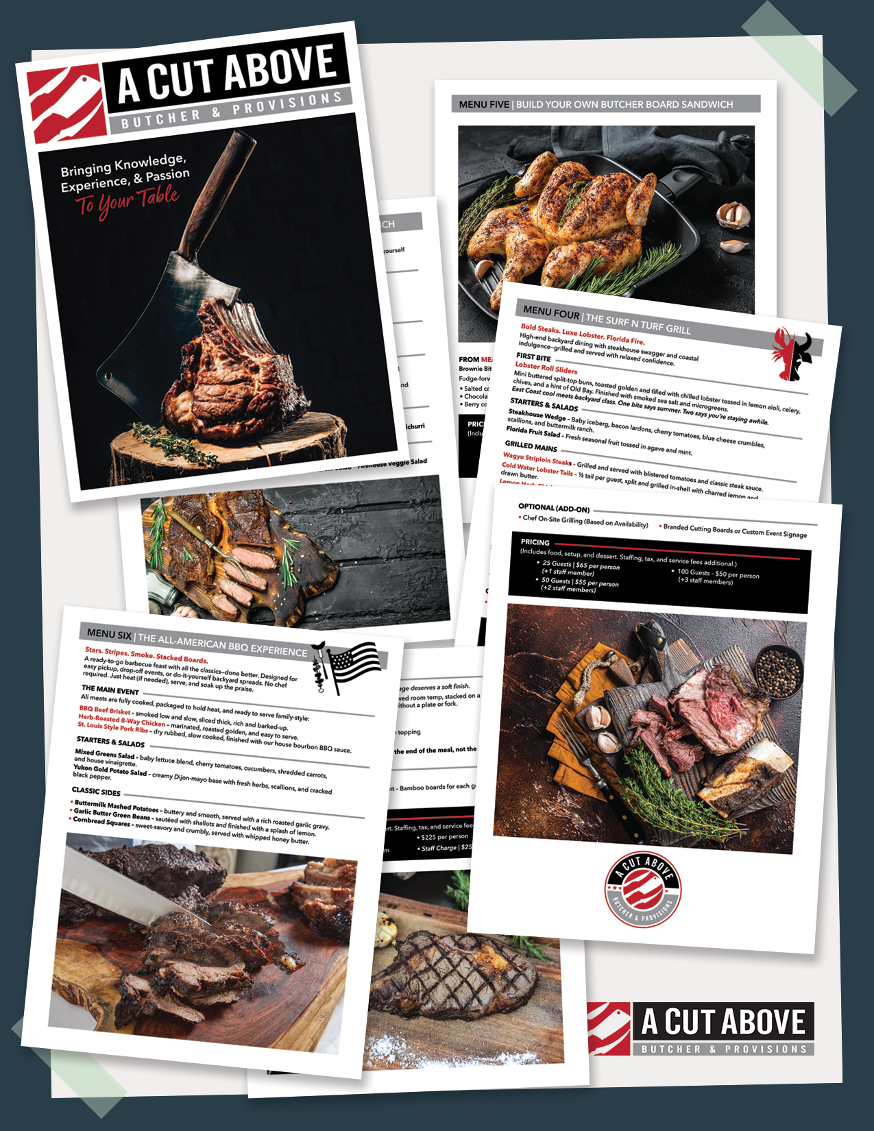
Marketing Booklet | A Cut Above
Designing the “A Cut Above” booklet was an exciting opportunity to showcase the brand’s premium services with a polished, contemporary look. The layout strikes a balance between striking visuals and clean, readable content, ensuring each page captures attention while remaining easy to navigate. Custom graphics, carefully selected photographs, and thoughtful typography all come together to reflect the elevated quality and unique character that set “A Cut Above” apart.
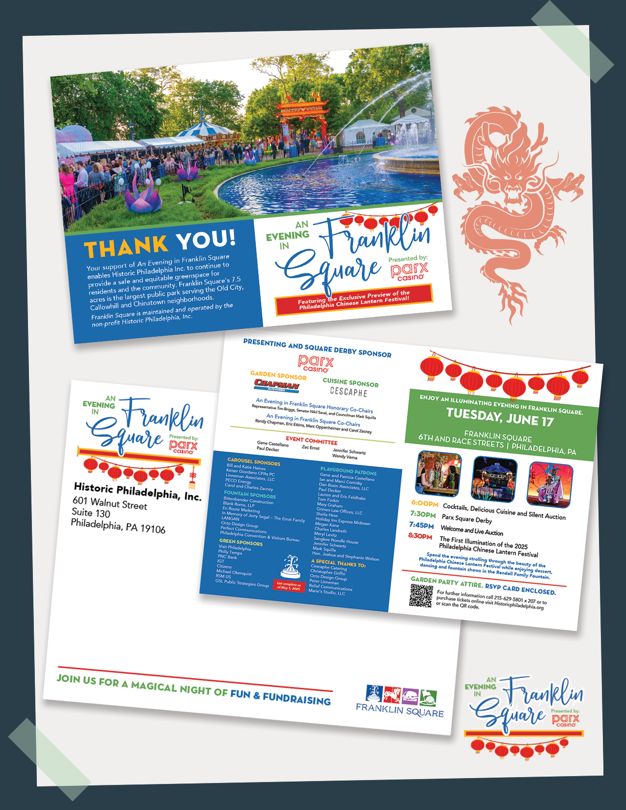
Philadelphia Chinese Lantern Festival | Franklin Square
The invitation design for the Philadelphia Chinese Lantern Festival captures the enchanting and vibrant spirit of this cultural celebration. Using rich colors, traditional motifs, and elegant typography, the design invites recipients into a festive experience full of light and wonder. The layout balances visual appeal with clear event details, making it both beautiful and functional, perfectly reflecting the festival’s blend of tradition and festivity.
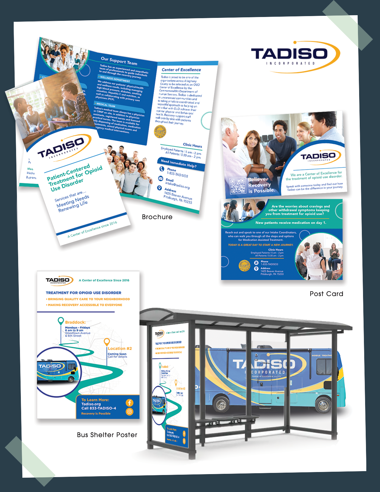
Branding | Tadiso
The Tadiso marketing materials—including the postcard, bus shelter poster, and brochure—were designed to create a consistent, engaging brand presence that educates and motivates the audience. The postcard offers a concise and visually appealing introduction, perfect for direct mail outreach. The bus shelter poster uses bold imagery and impactful messaging to capture attention in high-traffic areas. The brochure provides a more detailed look with organized content and inviting visuals to support informed decision-making. Together, these pieces build awareness and foster connection with Tadiso’s mission and services.
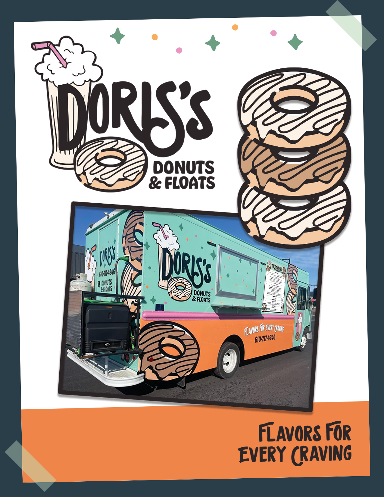
Logo/Vehicle Wrap | Doris’s Donuts
Created the Doris’s Donuts logo to be a vibrant and playful visual identity that captures the fun and sweetness of the brand. Its bold colors and friendly typography make it instantly recognizable and memorable. The vehicle wrap design extends this energetic branding onto their truck, transforming it into a moving billboard that attracts attention on the road. The wrap blends eye-catching graphics with clear messaging, ensuring maximum visibility while reflecting the brand’s joyful and approachable personality.
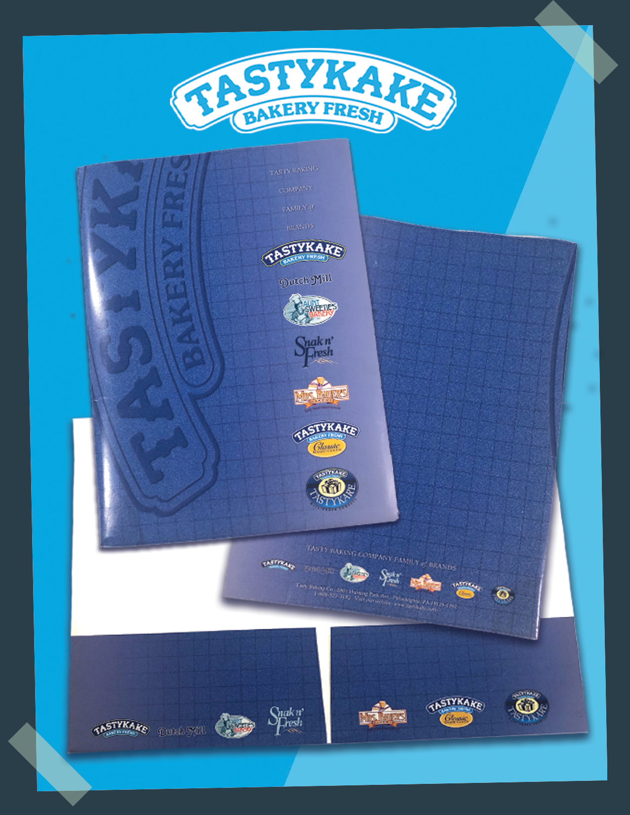
Folder | Tastykake
The Tastykake folder design captures the brand’s playful and delicious spirit with vibrant colors and inviting visuals. Crafted to organize and present materials neatly, the folder combines functionality with eye-catching branding elements that reflect Tastykake’s iconic treats. This design supports brand recognition and adds a touch of fun to every professional interaction. The Tastykake folder design captures the brand’s playful and delicious spirit with vibrant colors and inviting visuals. Crafted to organize and present materials neatly, the folder combines functionality with eye-catching branding elements that reflect Tastykake’s iconic treats. This design supports brand recognition and adds a touch of fun to every professional interaction.
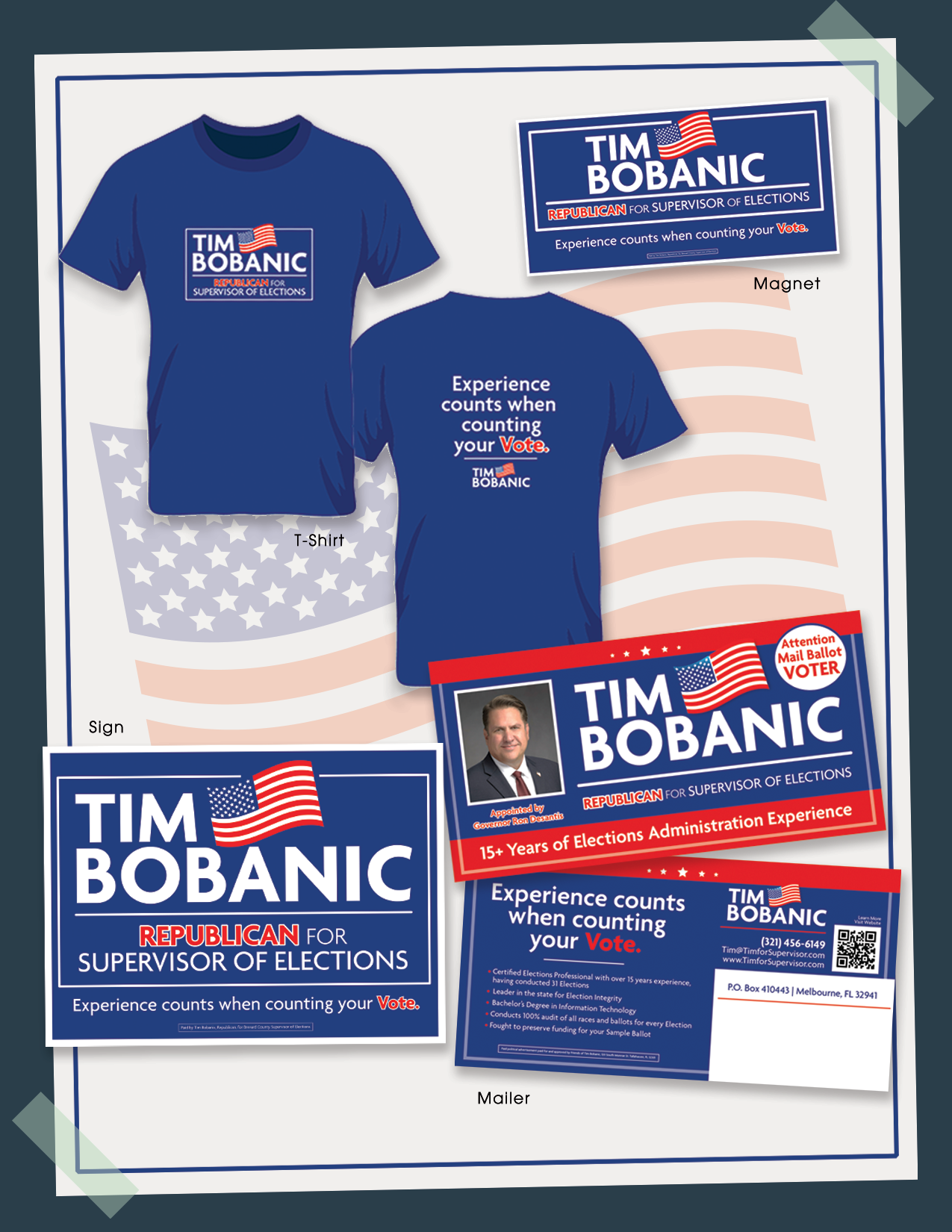
Campaign Materials | Tim Bobanic
The campaign pieces for Tim Bobanic were thoughtfully designed to create a unified and impactful presence across multiple touchpoints. The mailer delivers clear messaging with eye-catching visuals to engage and inform recipients, while the signs emphasize bold branding and visibility in high-traffic areas. The T-shirt design combines comfort with a standout look that supporters will proudly wear. The magnet adds a practical, lasting reminder of the campaign, keeping the message in view every day. Together, these elements form a cohesive and memorable campaign that effectively supports Tim Bobanic’s outreach goals.
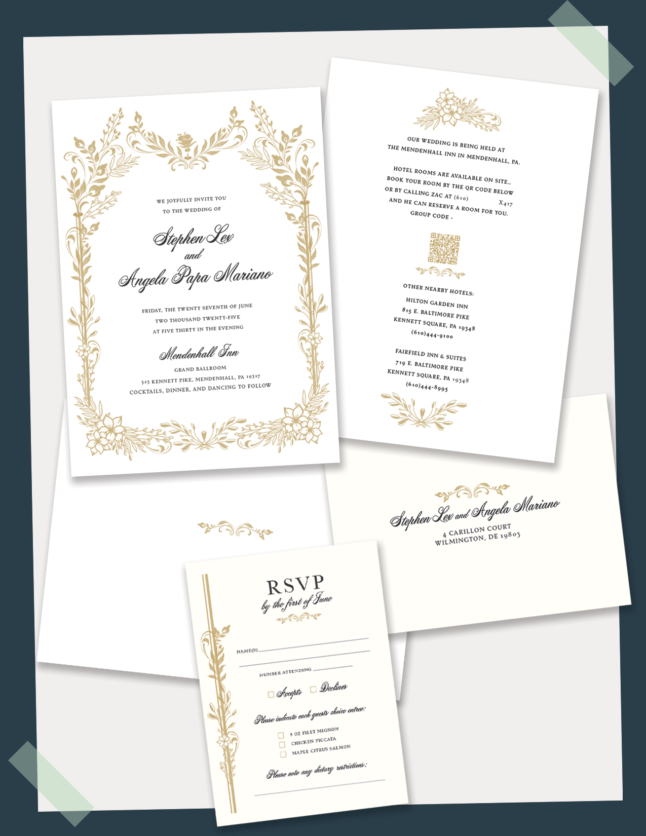
Wedding Invitation | Lex / Mariano
The wedding invitation for Lex and Mariano combines elegant typography with soft, romantic color tones to create a timeless and sophisticated design. Delicate floral accents and a balanced layout provide a warm and inviting feel, perfectly reflecting the couple’s unique style and the joyous celebration ahead. Working with Lex and Mariano, who are friends, made the project especially fun and rewarding. The design harmonizes tradition with modern flair. The wedding invitation for Lex and Mariano combines elegant typography with soft, romantic color tones to create a timeless and sophisticated design. Delicate floral accents and a balanced layout provide a warm and inviting feel, perfectly reflecting the couple’s unique style and the joyous celebration ahead. Working with Lex and Mariano, who are friends, made the project especially fun and rewarding. The design harmonizes tradition with modern flair.
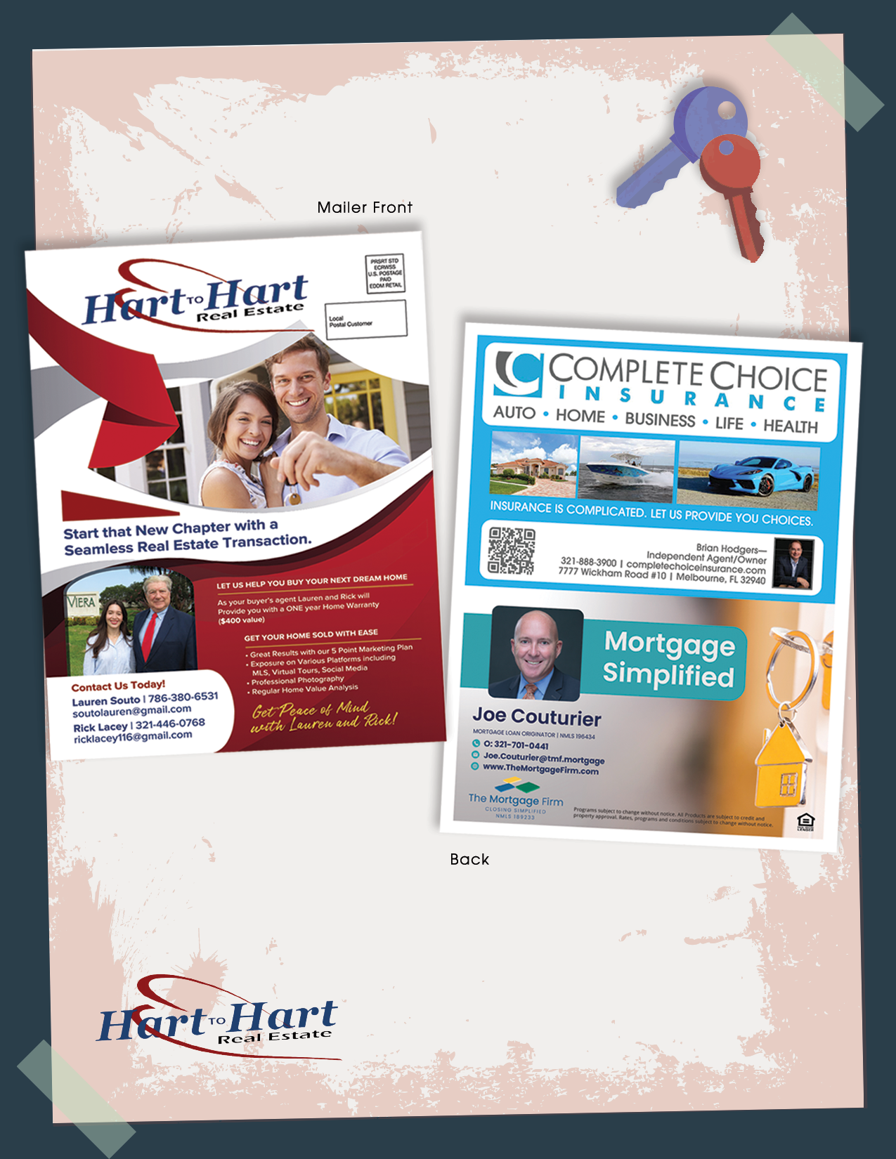
Ad/Mailer | Hart to Hart
The Hart to Hart ad/mailer was designed to create a memorable brand presence that captures attention quickly. Featuring clean, bold visuals and concise messaging, the piece effectively communicates key offers and brand personality in a format ideal for direct mail distribution. The design integrates compelling calls-to-action and a clear layout, ensuring the mailer not only engages recipients but also drives response and reinforces brand recognition. This strategic approach combines creativity with practical marketing goals to maximize impact.
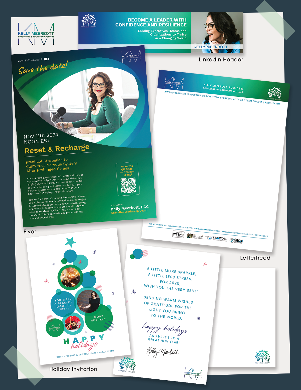
Branding | Kelly Meerbott
The design suite for Kelly Meerbott includes a cohesive collection of a flyer, holiday card, letterhead, and website header—each crafted to reflect her unique brand identity. The flyer draws attention with clear messaging, while the holiday card adds a warm, personal touch perfect for seasonal connection. The letterhead maintains professional elegance and brand consistency for all correspondence, and the website header delivers a modern, inviting introduction that enhances online presence. Together, these pieces create a unified and memorable aesthetic that supports Kelly’s professional image and engagement.